Tripular
LENGTH
5 Months
ROLE
UI/UX Design
DELIVERABLES
Design System, Wireframes, HiFi
HIGHLIGHTS
HIGHLIGHTS
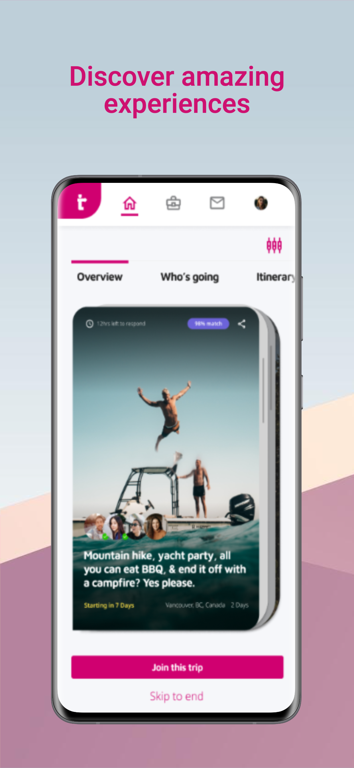
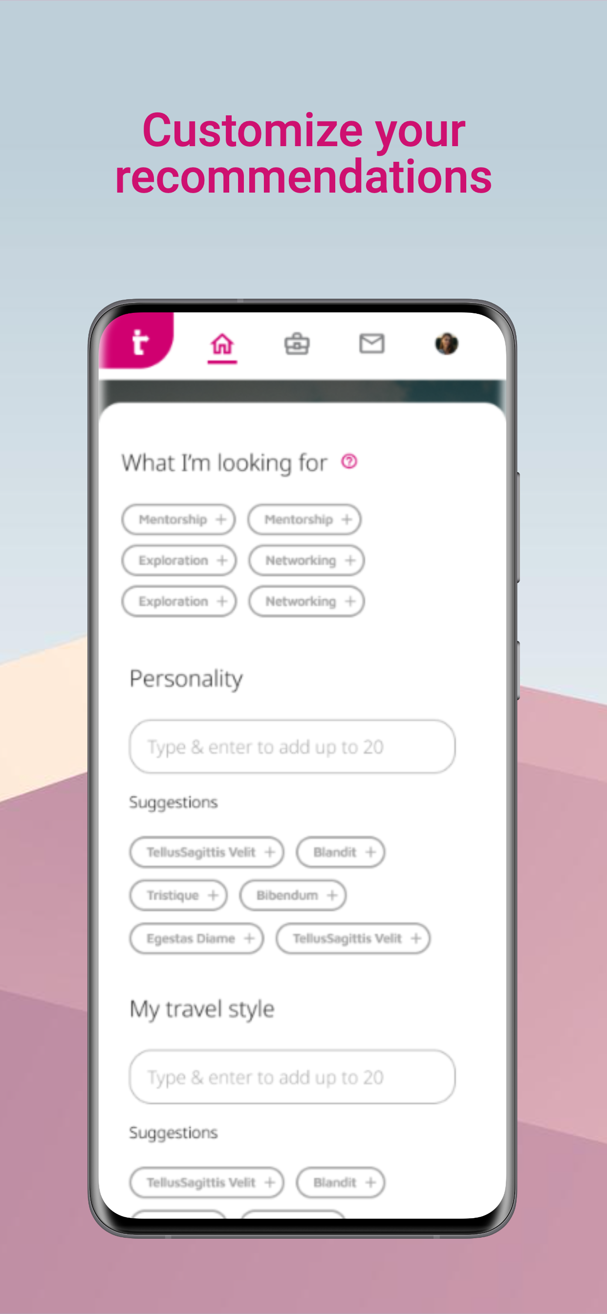
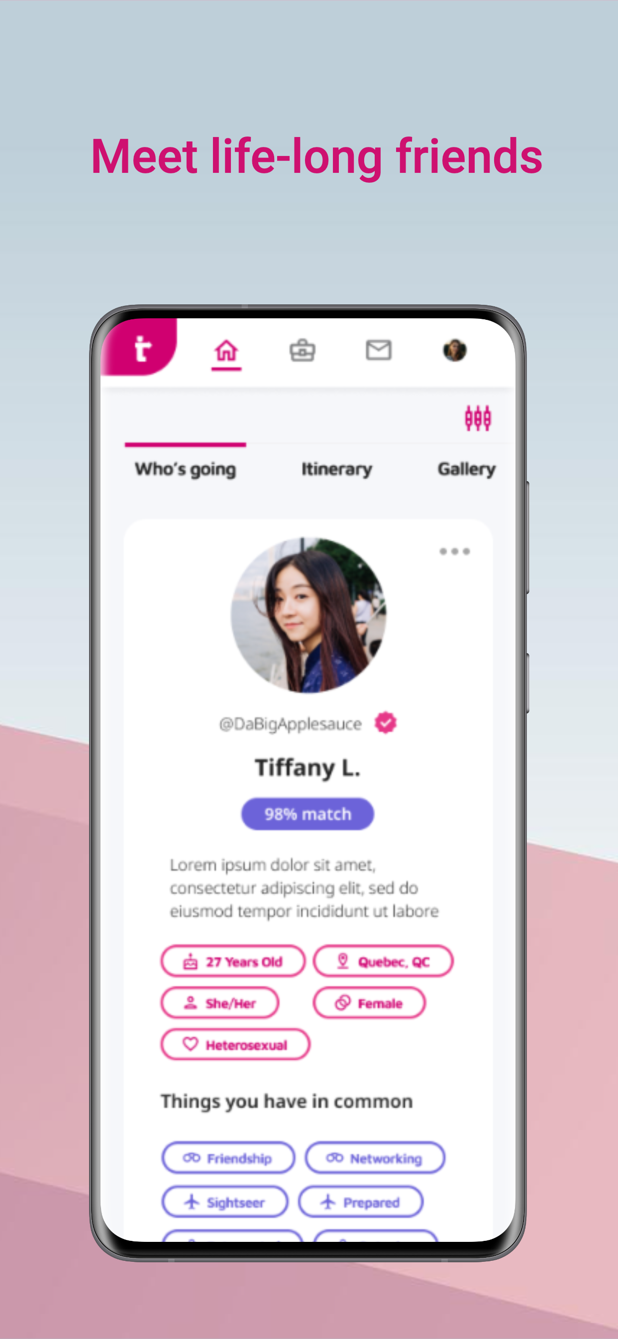
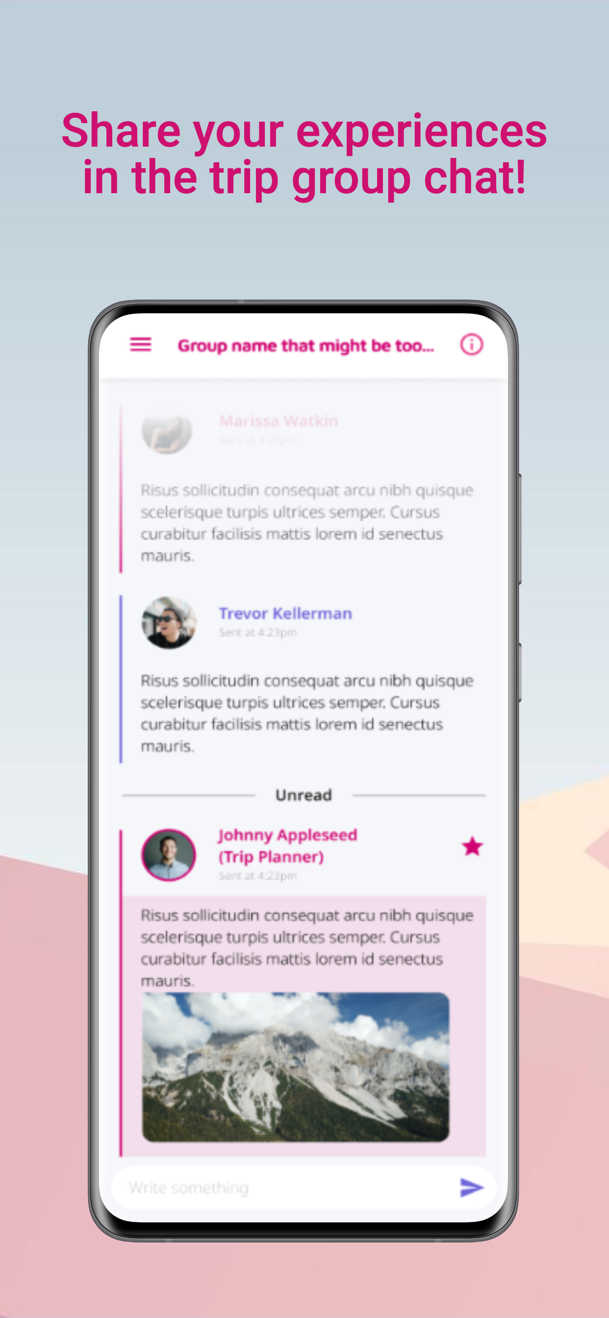
- worked on a revolutionary social travel app called "Tripular"
- launched a complete overhaul of the brand identity
- developed the design direction of the product
- worked on a revolutionary social travel app called "Tripular"
- launched a complete overhaul of the brand identity
- developed the design direction of the product
- worked on a revolutionary social travel app
- launched a complete overhaul of the brand identity
- developed the design direction of the product
- worked on a revolutionary social travel app called "Tripular"
- launched a complete overhaul of the brand identity
- developed the design direction of the product
- worked on a revolutionary social travel app called "Tripular"
- launched a complete overhaul of the brand identity
- developed the design direction of the product
PROBLEM
PROBLEM
Lunaventura came to us looking for a complete overhaul of their current brand, and to take on the design direction of their upcoming social travel app.
Lunaventura came to us looking for a complete overhaul of their current brand, and to take on the design direction of their upcoming social travel app.
Lunaventura came to us looking for a complete overhaul of their current brand, and to take on the design direction of their upcoming social travel app.
Lunaventura came to us looking for a complete overhaul of their current brand, and to take on the design direction of their upcoming social travel app.
PROJECT GOALS
PROJECT GOALS
PROJECT GOALS
PROJECT GOALS
Understand the full scope of the current competition, product offerings, and target market.
Understand the full scope of the current competition, product offerings, and target market.
Understand the full scope of the current competition, product offerings, and target market.
Understand the full scope of the current competition, product offerings, and target market.
Understand the full scope of the current competition, product offerings, and target market.
Present a complete new design direction to head towards.
Present a complete new design direction to head towards.
Present a complete new design direction to head towards.
Present a complete new design direction to head towards.
Present a complete new design direction to head towards.
Flesh out flows and deliver hi-fi prototypes.
Flesh out flows and deliver hi-fi prototypes.
Flesh out flows and deliver hi-fi prototypes.
Flesh out flows and deliver hi-fi prototypes.
Flesh out flows and deliver hi-fi prototypes.
Test with users and improve experience with feedback.
Test with users and improve experience with feedback.
Test with users and improve experience with feedback.
Test with users and improve experience with feedback.
Test with users and improve experience with feedback.
PHASE 1: DISCOVER
PHASE 1: DISCOVER
PHASE 1: DISCOVER
PHASE 1: DISCOVER
PHASE 1: DISCOVER
When Lunaventura first pitched their idea of a social travel app to us, we were initially unfamiliar with the travel landscape so we conducted research on the competition and the general travel app space. This gave us our Competitive Analysis and showed us the gaps where the app would stand out among the rest in terms of what it could offer.
When Lunaventura first pitched their idea of a social travel app to us, we were initially unfamiliar with the travel landscape so we conducted research on the competition and the general travel app space. This gave us our Competitive Analysis and showed us the gaps where the app would stand out among the rest in terms of what it could offer.
When Lunaventura first pitched their idea of a social travel app to us, we were initially unfamiliar with the travel landscape so we conducted research on the competition and the general travel app space. This gave us our Competitive Analysis and showed us the gaps where the app would stand out among the rest in terms of what it could offer.
When Lunaventura first pitched their idea of a social travel app to us, we were initially unfamiliar with the travel landscape so we conducted research on the competition and the general travel app space. This gave us our Competitive Analysis and showed us the gaps where the app would stand out among the rest in terms of what it could offer.
When Lunaventura first pitched their idea of a social travel app to us, we were initially unfamiliar with the travel landscape so we conducted research on the competition and the general travel app space. This gave us our Competitive Analysis and showed us the gaps where the app would stand out among the rest in terms of what it could offer.
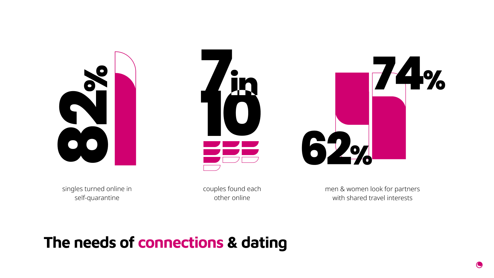
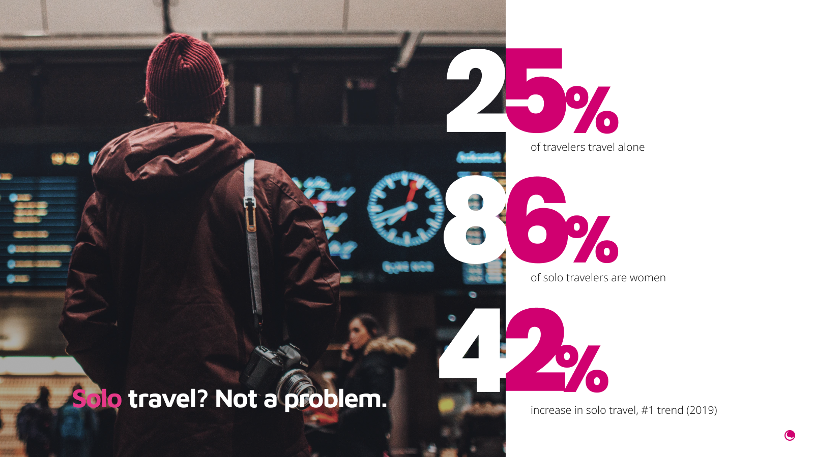
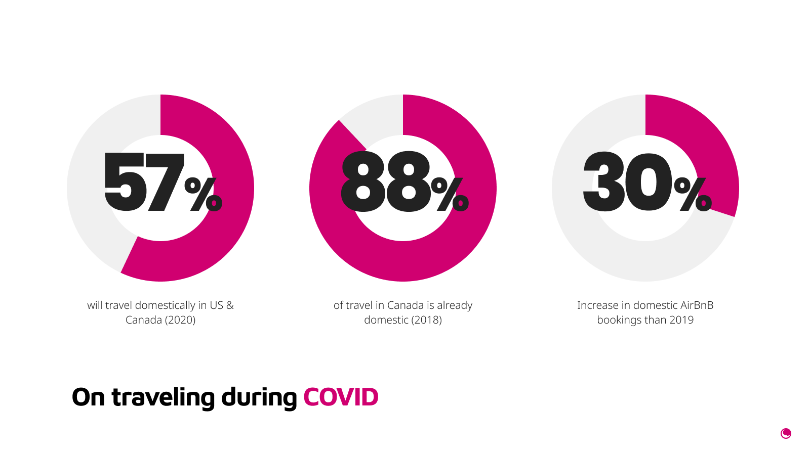
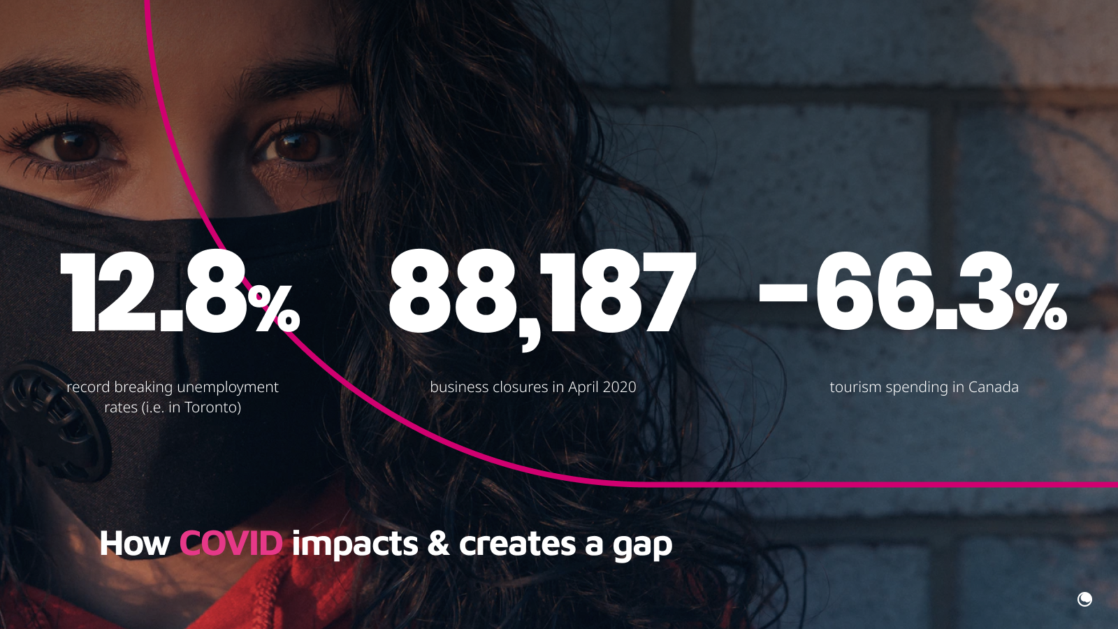
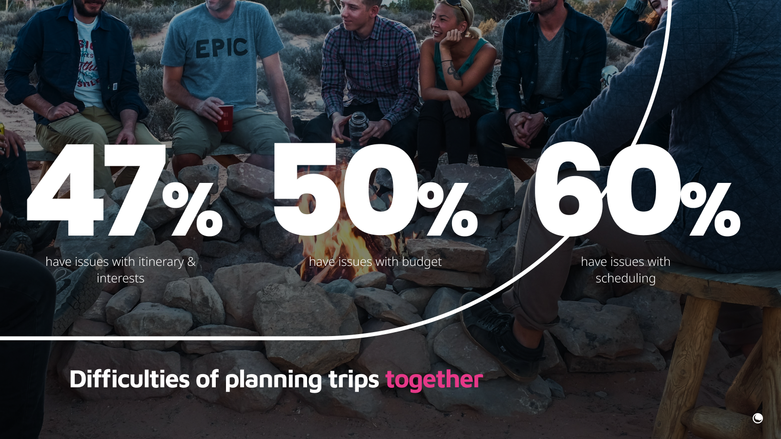
We also dove deeper into the numbers and learned about the market of people who loved to travel. This showed us that these same people also had an interest in expanding their social circles, find a romantic partner, or simply needed a side gig to fund more adventures in the future especially since during this time, COVID was still running rampant and concerns for financial stability were constantly looming in the air.
With this understanding, we were ready to move on to the next step.
PHASE 2: DEFINE
PHASE 2: DEFINE
PHASE 2: DEFINE
PHASE 2: DEFINE
PHASE 2: DEFINE
For us, it wasn't enough to understand the competition, we also needed to understand our users! Thankfully, Lunaventura had already cultivated a sizable community who we reached out to and received over 100+ responses! With this data, we were able to set up a variety of user personas. These people also ended up making up the bulk of our initial beta testers.
For us, it wasn't enough to understand the competition, we also needed to understand our users! Thankfully, Lunaventura had already cultivated a sizable community who we reached out to and received over 100+ responses! With this data, we were able to set up a variety of user personas. These people also ended up making up the bulk of our initial beta testers.
For us, it wasn't enough to understand the competition, we also needed to understand our users! Thankfully, Lunaventura had already cultivated a sizable community who we reached out to and received over 100+ responses! With this data, we were able to set up a variety of user personas. These people also ended up making up the bulk of our initial beta testers.
For us, it wasn't enough to understand the competition, we also needed to understand our users! Thankfully, Lunaventura had already cultivated a sizable community who we reached out to and received over 100+ responses! With this data, we were able to set up a variety of user personas. These people also ended up making up the bulk of our initial beta testers.
For us, it wasn't enough to understand the competition, we also needed to understand our users! Thankfully, Lunaventura had already cultivated a sizable community who we reached out to and received over 100+ responses! With this data, we were able to set up a variety of user personas. These people also ended up making up the bulk of our initial beta testers.
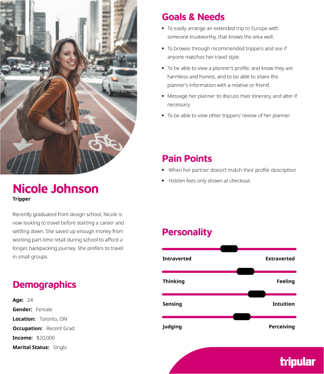
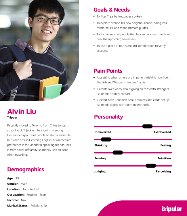
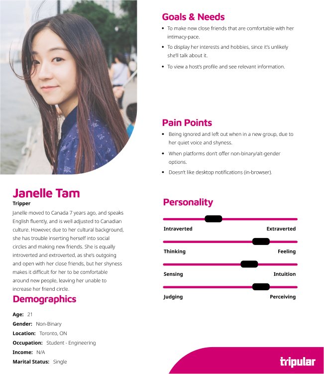
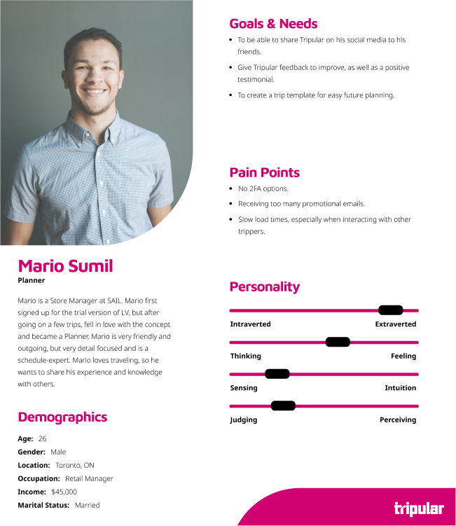
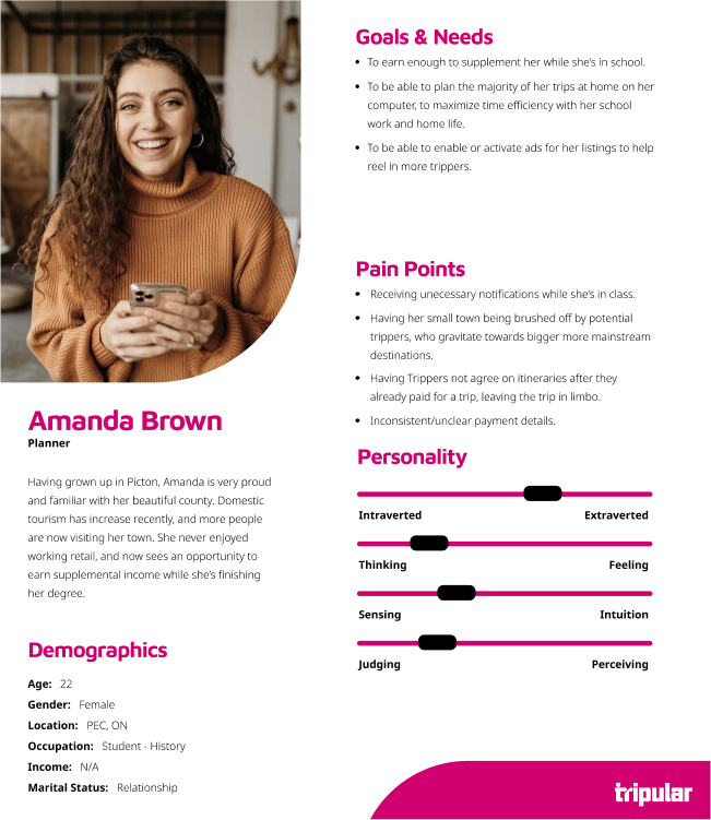
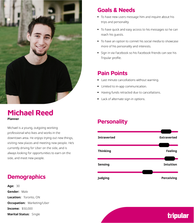
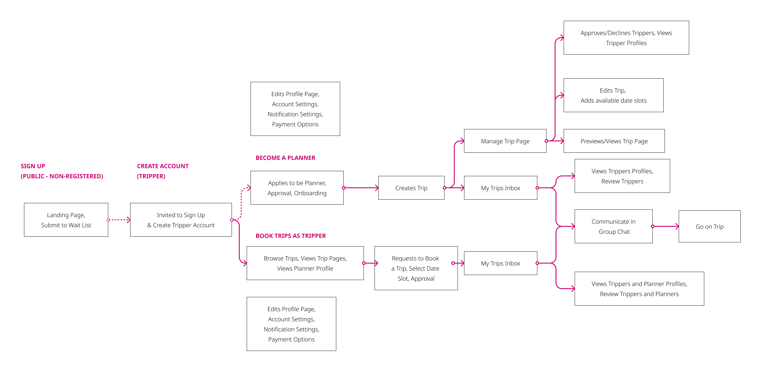
We also got to work on a rough outline of the user journey and in the process, settled on the two main groups of users: Tripper & Planner. This provided us with a rough idea of how the app would function, and how users would interact with it.
We also got to work on a rough outline of the user journey and in the process, settled on the two main groups of users: Tripper & Planner. This provided us with a rough idea of how the app would function, and how users would interact with it.
We also got to work on a rough outline of the user journey and in the process, settled on the two main groups of users: Tripper & Planner. This provided us with a rough idea of how the app would function, and how users would interact with it.
We also got to work on a rough outline of the user journey and in the process, settled on the two main groups of users: Tripper & Planner. This provided us with a rough idea of how the app would function, and how users would interact with it.
We also got to work on a rough outline of the user journey and in the process, settled on the two main groups of users: Tripper & Planner. This provided us with a rough idea of how the app would function, and how users would interact with it.
PHASE 2.5: DESIGN
PHASE 2.5: DESIGN
PHASE 2.5: DESIGN
PHASE 2.5: DESIGN
PHASE 2.5: DESIGN
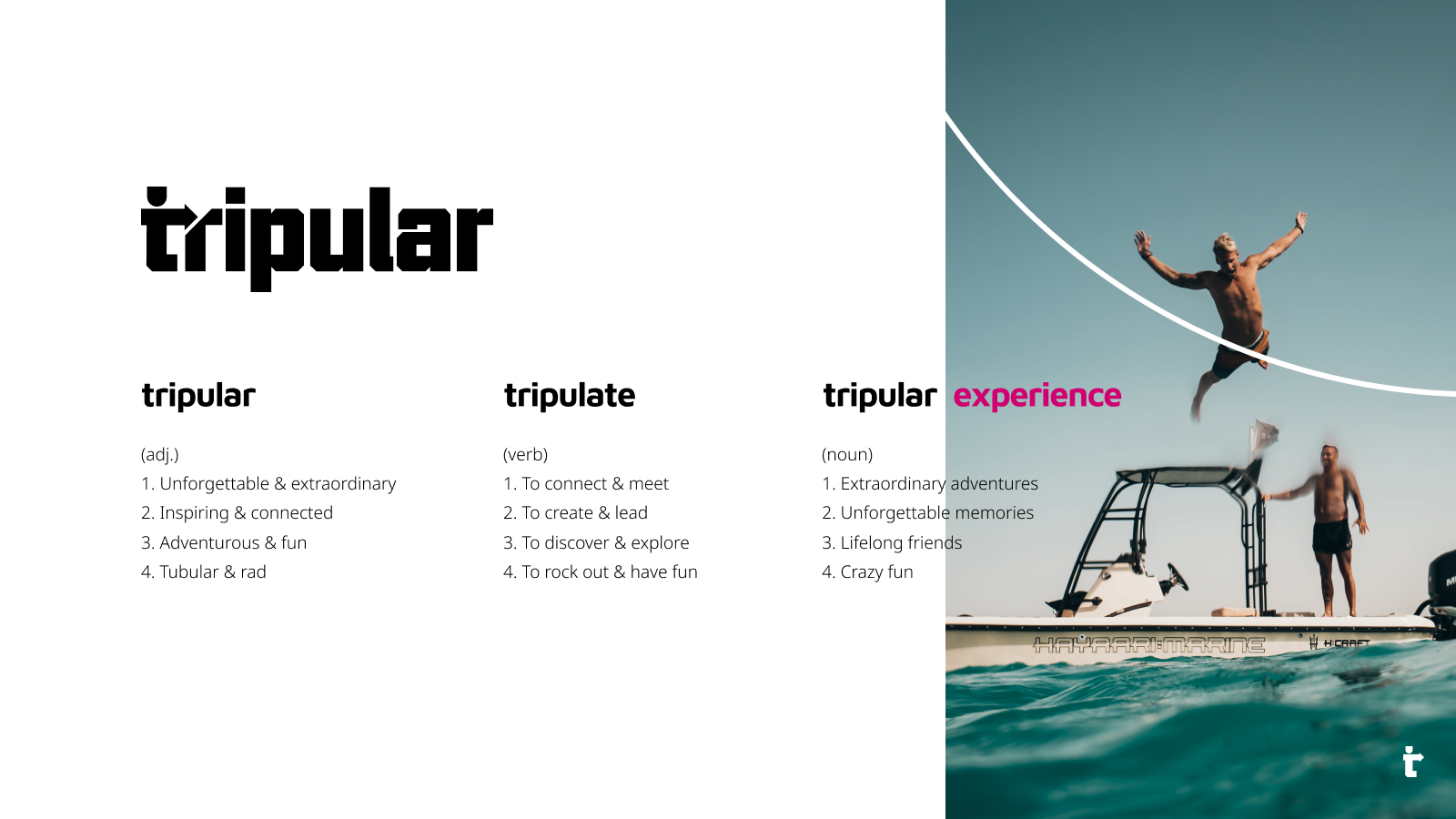
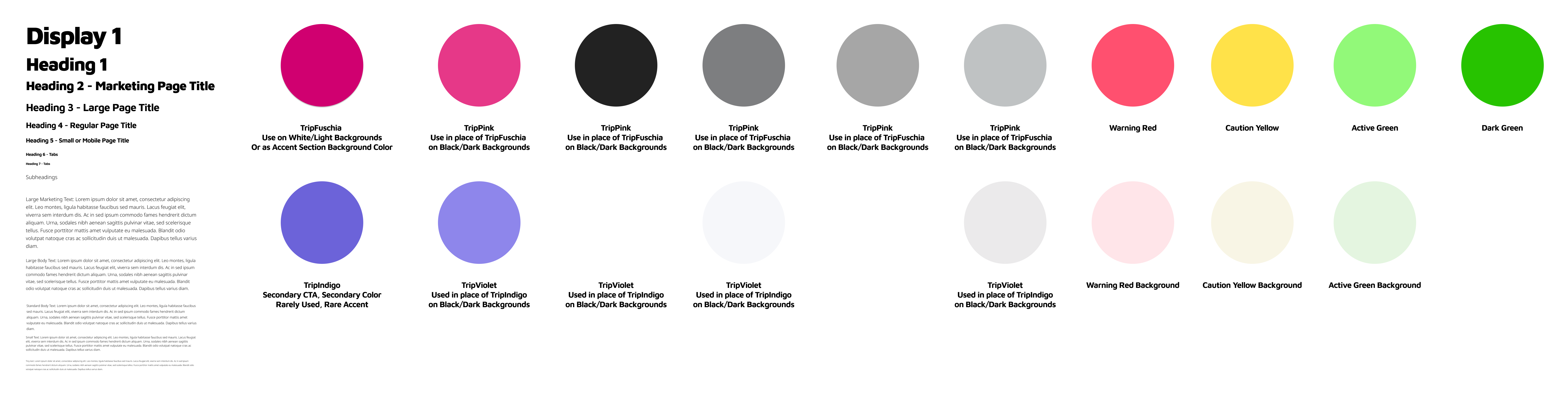
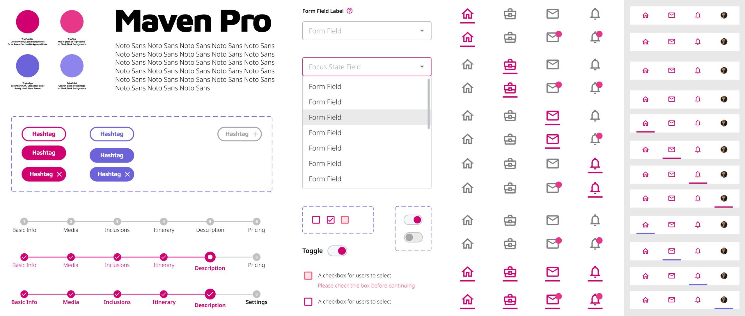
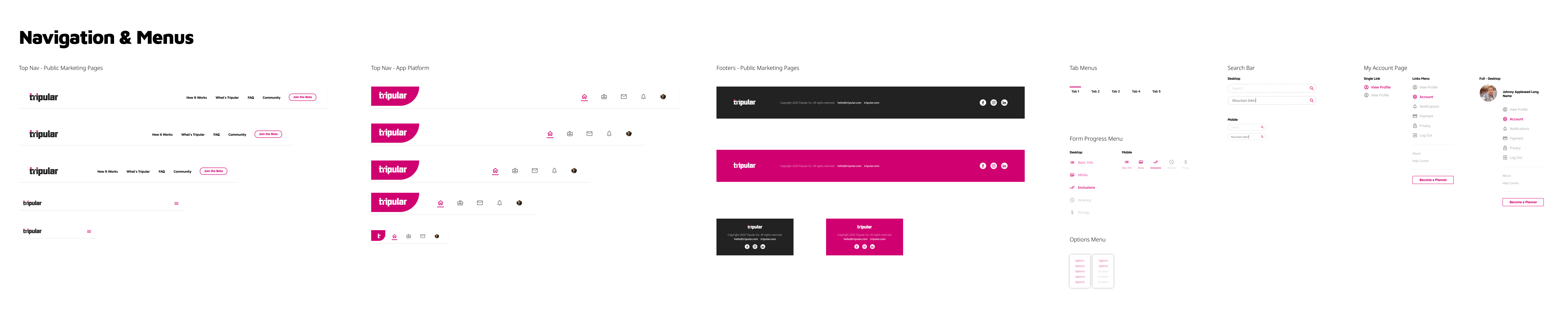
While all this was going on, the Design Lead and I worked on the Design System so that when the team started wireframing, there would be a library of assets ready to work with. This is also when the word "Tripular" was conceived and drove the direction of the brand identity.
This was continuously updated as the project went on.


PHASE 3: DEVELOP
PHASE 3: DEVELOP
PHASE 3: DEVELOP
PHASE 3: DEVELOP
PHASE 3: DEVELOP
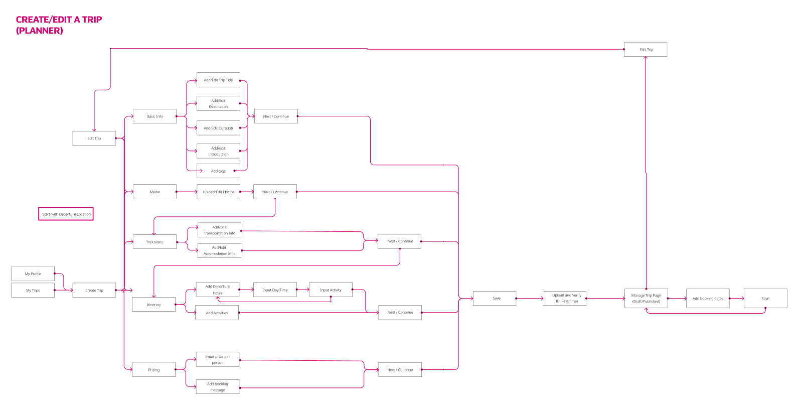
A teammate and I were assigned the Create/Edit Trip flow. We took a look at the user flow, user stories, and started looking for some inspiration before splitting off and roughing out our first designs.
A teammate and I were assigned the Create/Edit Trip flow. We took a look at the user flow, user stories, and started looking for some inspiration before splitting off and roughing out our first designs.
A teammate and I were assigned the Create/Edit Trip flow. We took a look at the user flow, user stories, and started looking for some inspiration before splitting off and roughing out our first designs.
A teammate and I were assigned the Create/Edit Trip flow. We took a look at the user flow, user stories, and started looking for some inspiration before splitting off and roughing out our first designs.
A teammate and I were assigned the Create/Edit Trip flow. We took a look at the user flow, user stories, and started looking for some inspiration before splitting off and roughing out our first designs.
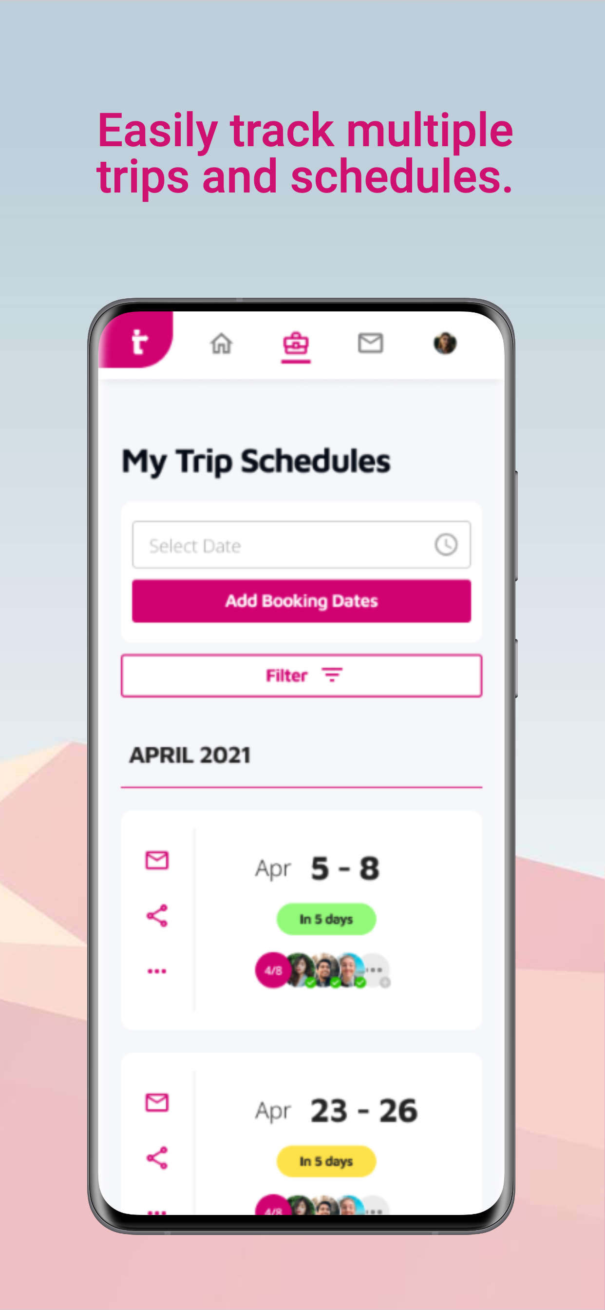
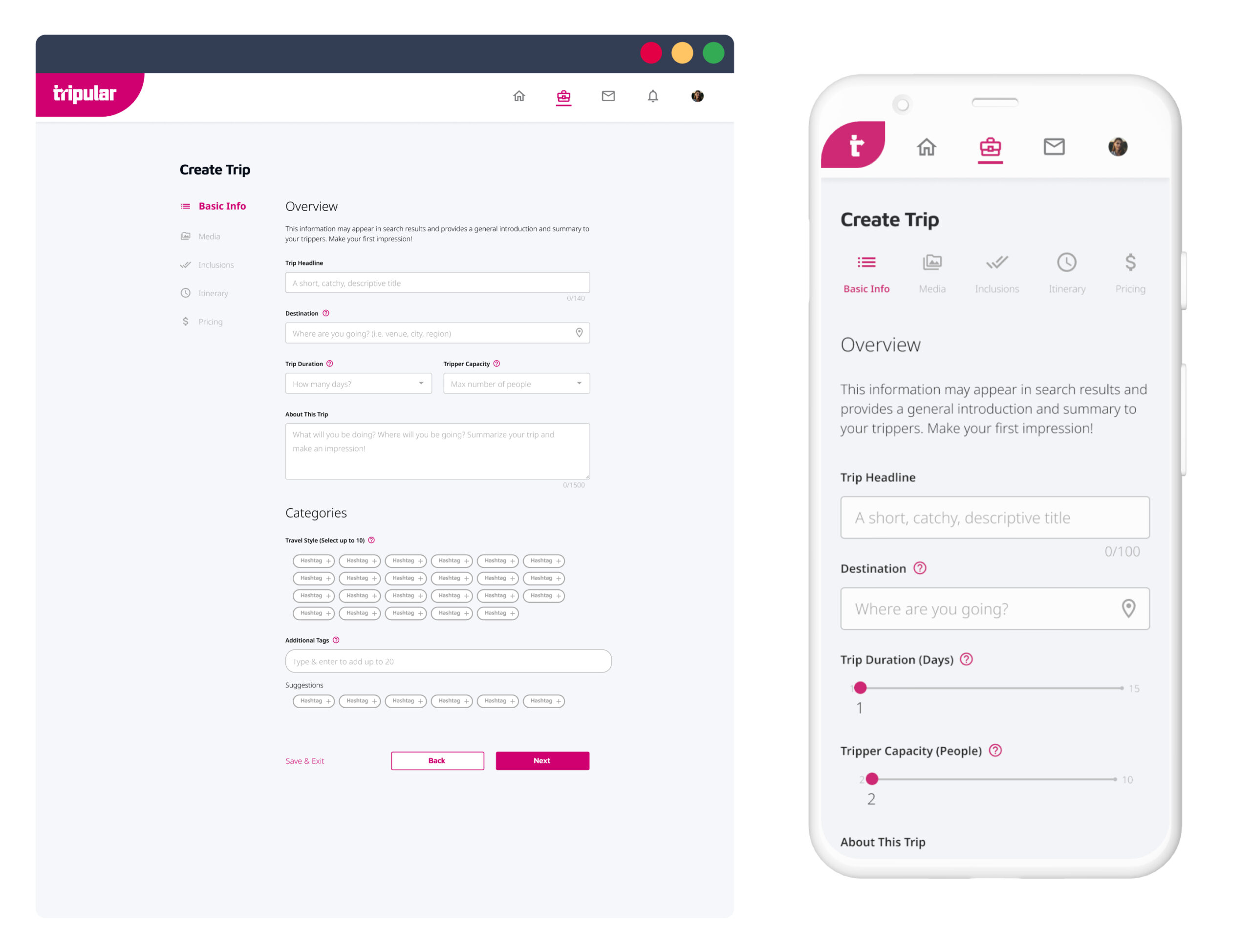
Below, you can see some exploration of the nav menu. I experimented with vertical and horizontal placements, and whether the text should be on the left or the right. This is the Basic Info section for the Tripper to start inputting trip information like Title, Destination, Duration and Description.
Below, you can see some exploration of the nav menu. I experimented with vertical and horizontal placements, and whether the text should be on the left or the right. This is the Basic Info section for the Tripper to start inputting trip information like Title, Destination, Duration and Description.
Below, you can see some exploration of the nav menu. I experimented with vertical and horizontal placements, and whether the text should be on the left or the right. This is the Basic Info section for the Tripper to start inputting trip information like Title, Destination, Duration and Description.
Below, you can see some exploration of the nav menu. I experimented with vertical and horizontal placements, and whether the text should be on the left or the right. This is the Basic Info section for the Tripper to start inputting trip information like Title, Destination, Duration and Description.
Below, you can see some exploration of the nav menu. I experimented with vertical and horizontal placements, and whether the text should be on the left or the right. This is the Basic Info section for the Tripper to start inputting trip information like Title, Destination, Duration and Description.
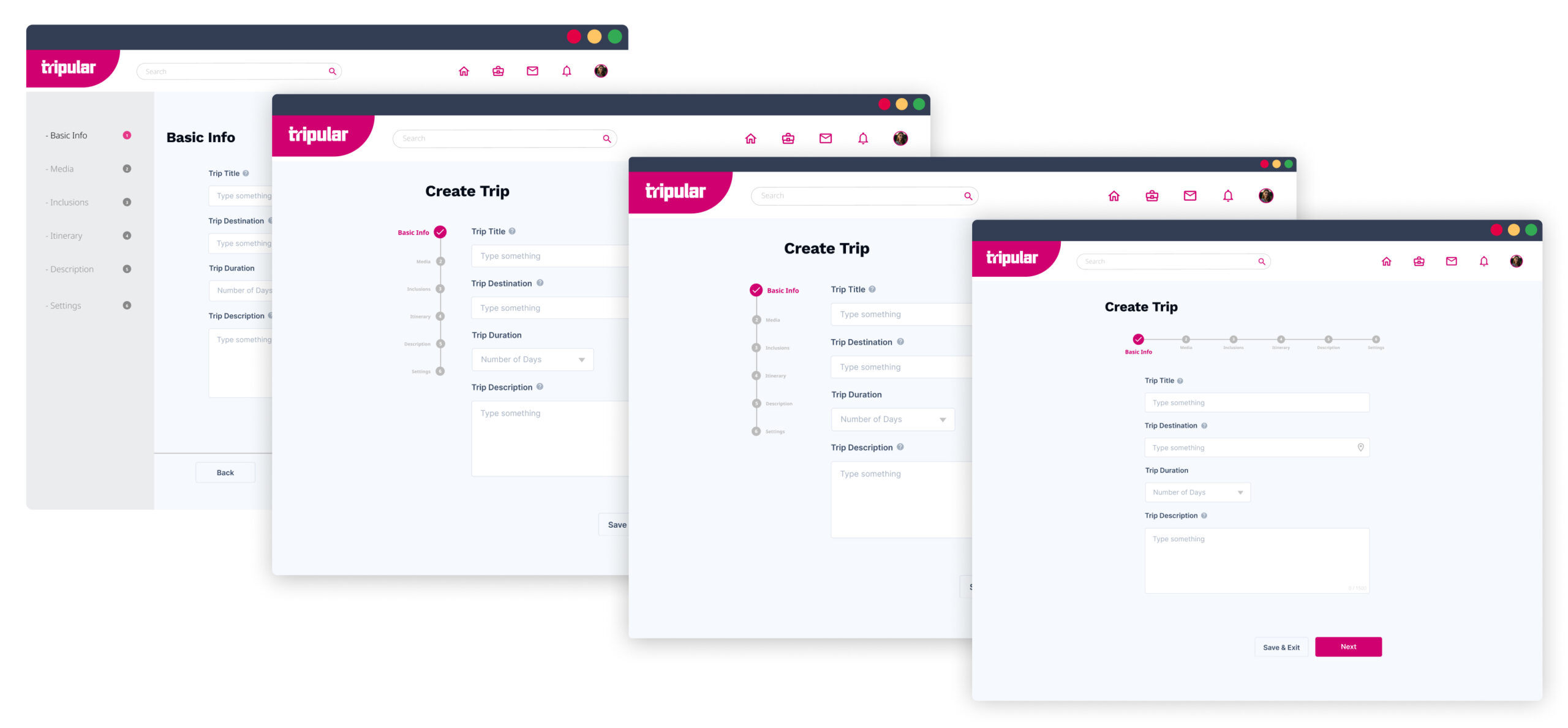
After a round of feedbacks, vertical was chosen for desktop view while horizonal was chosen for mobile. There were also some updates such as the addition of Tripper Capacity and the Tags feature. My teammate was later moved to a different flow so I was in charge of bringing this flow to the finish line.
After a round of feedbacks, vertical was chosen for desktop view while horizonal was chosen for mobile. There were also some updates such as the addition of Tripper Capacity and the Tags feature. My teammate was later moved to a different flow so I was in charge of bringing this flow to the finish line.
After a round of feedbacks, vertical was chosen for desktop view while horizonal was chosen for mobile. There were also some updates such as the addition of Tripper Capacity and the Tags feature. My teammate was later moved to a different flow so I was in charge of bringing this flow to the finish line.
After a round of feedbacks, vertical was chosen for desktop view while horizonal was chosen for mobile. There were also some updates such as the addition of Tripper Capacity and the Tags feature. My teammate was later moved to a different flow so I was in charge of bringing this flow to the finish line.
After a round of feedbacks, vertical was chosen for desktop view while horizonal was chosen for mobile. There were also some updates such as the addition of Tripper Capacity and the Tags feature. My teammate was later moved to a different flow so I was in charge of bringing this flow to the finish line.
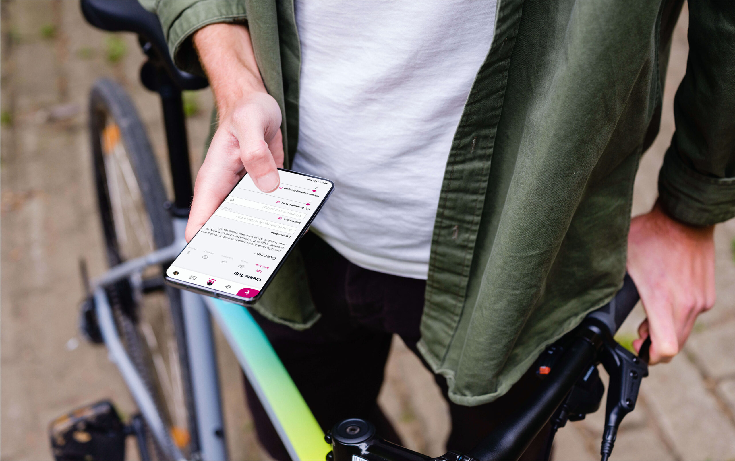
As you can see on the mobile mock-up on the right, certain decisions were made to accommodate for a more mobile friendly experience, such as opting to go with a more intuitive tap-and-drag feature instead of having to type the number with a keyboard.
As you can see on the mobile mock-up on the right, certain decisions were made to accommodate for a more mobile friendly experience, such as opting to go with a more intuitive tap-and-drag feature instead of having to type the number with a keyboard.
As you can see on the mobile mock-up on the right, certain decisions were made to accommodate for a more mobile friendly experience, such as opting to go with a more intuitive tap-and-drag feature instead of having to type the number with a keyboard.
As you can see on the mobile mock-up on the right, certain decisions were made to accommodate for a more mobile friendly experience, such as opting to go with a more intuitive tap-and-drag feature instead of having to type the number with a keyboard.
As you can see on the mobile mock-up on the right, certain decisions were made to accommodate for a more mobile friendly experience, such as opting to go with a more intuitive tap-and-drag feature instead of having to type the number with a keyboard.
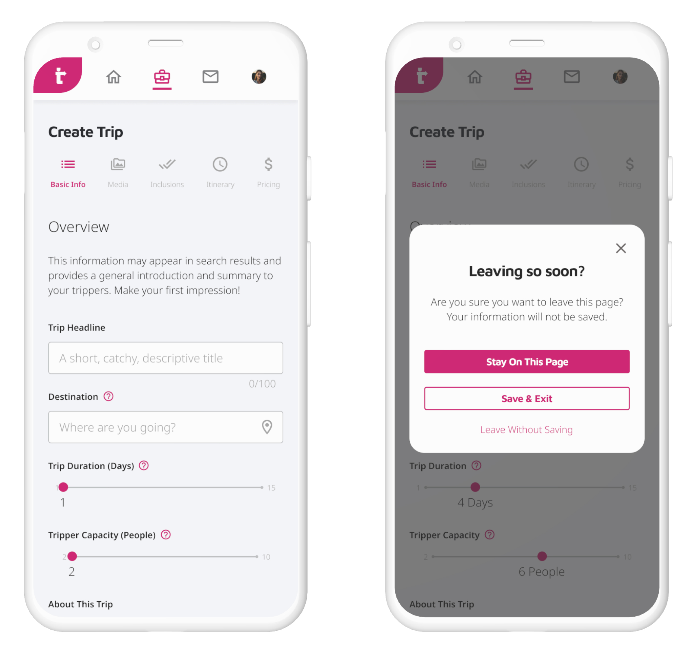
Here, you can see the error window that pops up to warn the user if they decide to use a native shortcut to exit out of the app instead of using our internal “Save & Exit” button to save our users the frustration of possibly losing all their information.
Here, you can see the error window that pops up to warn the user if they decide to use a native shortcut to exit out of the app instead of using our internal “Save & Exit” button to save our users the frustration of possibly losing all their information.
Here, you can see the error window that pops up to warn the user if they decide to use a native shortcut to exit out of the app instead of using our internal “Save & Exit” button to save our users the frustration of possibly losing all their information.
Here, you can see the error window that pops up to warn the user if they decide to use a native shortcut to exit out of the app instead of using our internal “Save & Exit” button to save our users the frustration of possibly losing all their information.
Here, you can see the error window that pops up to warn the user if they decide to use a native shortcut to exit out of the app instead of using our internal “Save & Exit” button to save our users the frustration of possibly losing all their information.
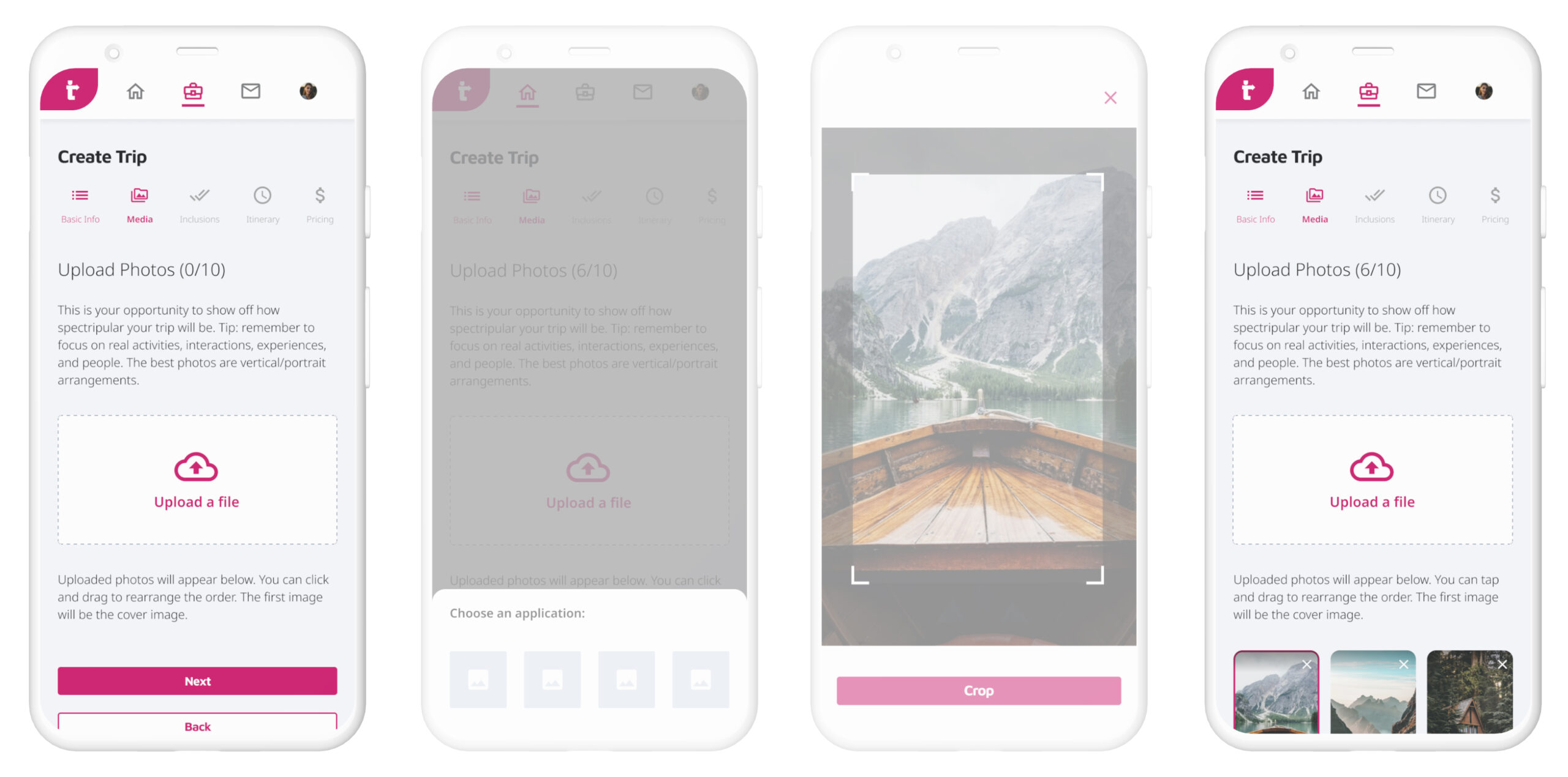
This is the Media section. This section encourages the Planner to populate their trip page with beautiful photos that will entice Trippers to join.
Originally, this process involved relying on the native camera app to crop and upload. With the Dev team’s guidance, it was suggested that at this early stage, it would be better to request the user to crop/adjust their pics outside of the app because this was actually a custom functionality and we would have had to provide this feature in app, hence this section was removed from the flow. They are shown here for visual purposes only.
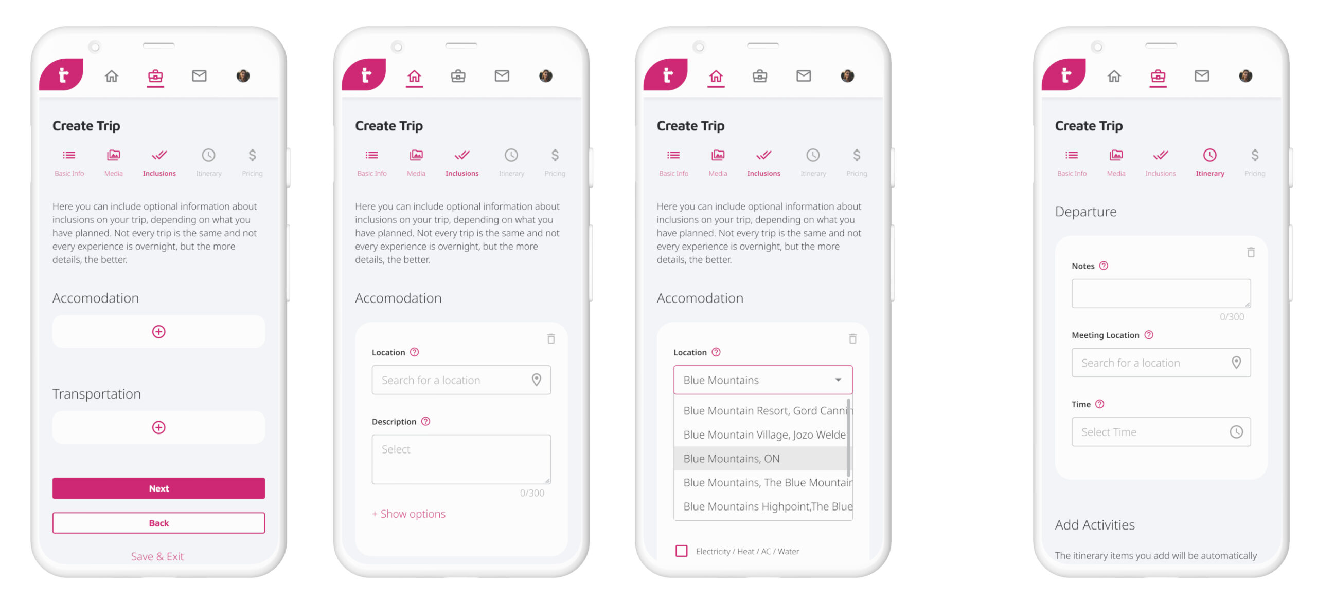
One challenge we encountered in the Inclusions and Itinerary section was that users could accidentally enter itinerary items out of order when it would be best to be ordered chronologically from a Tripper perspective. Should we have included an option to drag and rearrange order? That could potentially allow space for human error however. We reached out to the Dev team who gave confirmation and moved on.
One challenge we encountered in the Inclusions and Itinerary section was that users could accidentally enter itinerary items out of order when it would be best to be ordered chronologically from a Tripper perspective. Should we have included an option to drag and rearrange order? That could potentially allow space for human error however. We reached out to the Dev team who gave confirmation and moved on.
One challenge we encountered in the Inclusions and Itinerary section was that users could accidentally enter itinerary items out of order when it would be best to be ordered chronologically from a Tripper perspective. Should we have included an option to drag and rearrange order? That could potentially allow space for human error however. We reached out to the Dev team who gave confirmation and moved on.
One challenge we encountered in the Inclusions and Itinerary section was that users could accidentally enter itinerary items out of order when it would be best to be ordered chronologically from a Tripper perspective. Should we have included an option to drag and rearrange order? That could potentially allow space for human error however. We reached out to the Dev team who gave confirmation and moved on.
One challenge we encountered in the Inclusions and Itinerary section was that users could accidentally enter itinerary items out of order when it would be best to be ordered chronologically from a Tripper perspective. Should we have included an option to drag and rearrange order? That could potentially allow space for human error however. We reached out to the Dev team who gave confirmation and moved on.
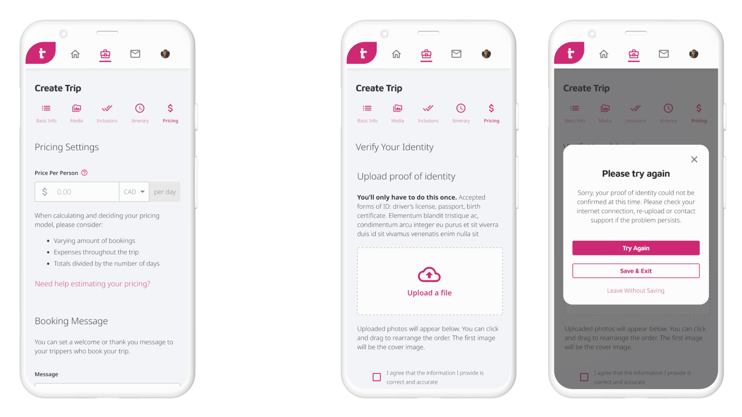
Pricing ended up being a little different from originally intended (left) because we received some thoughts from Legal: if the Planner had never booked a trip before, meaning they never had the experience of being a Tripper, that would mean they had also never verified their identity and so an extra step was added here (right).
Pricing ended up being a little different from originally intended (left) because we received some thoughts from Legal: if the Planner had never booked a trip before, meaning they never had the experience of being a Tripper, that would mean they had also never verified their identity and so an extra step was added here (right).
Pricing ended up being a little different from originally intended (left) because we received some thoughts from Legal: if the Planner had never booked a trip before, meaning they never had the experience of being a Tripper, that would mean they had also never verified their identity and so an extra step was added here (right).
Pricing ended up being a little different from originally intended (left) because we received some thoughts from Legal: if the Planner had never booked a trip before, meaning they never had the experience of being a Tripper, that would mean they had also never verified their identity and so an extra step was added here (right).
Pricing ended up being a little different from originally intended (left) because we received some thoughts from Legal: if the Planner had never booked a trip before, meaning they never had the experience of being a Tripper, that would mean they had also never verified their identity and so an extra step was added here (right).
PHASE 4: DELIVER
PHASE 4: DELIVER
PHASE 4: DELIVER
PHASE 4: DELIVER
PHASE 4: DELIVER
Finally, it was handed off to the Dev team to code and we also sent it off to the users who agreed to be our beta testers. Our group included 12 individuals who in turn would make comments as they envisioned using the rough prototype. Majority of them commented about how the Inclusion section seemed rather tedious to have to add each individual activity which we agreed with. This would need to be streamlined and optimized to not seem like a chore.
What if they wanted to include a section where the Trippers could have some solo time to explore on their own like in regular tours? Would that go in Departure? Or Activity? What was the difference between a Departure and Activity? There were many things to consider after this session so it was clear that there was still much to do to make the app more efficient and easy for users to understand.