Lettering
CLIENTS
Various

SUMMARY
I started taking lettering commissions from numerous clients looking for a bespoke logotype to represent their brand as a virtual streamer on the internet (to be referred to as 'vtuber' from now on).
In the process, I learned a lot about the process of creating letterforms from scratch, and it propelled my passion for type further than I ever imagined!
TL;DR
- take 1 cup of really cool vtubers on the internet who are looking to start their streaming career
- add 1 designer who loves typography and has the years of design experience & education to back it up
- what started as passion project turned into a source of side income!
HIGHLIGHTS
- experimented with a variety of styles: serif, sans-serif, slab-serif, calligraphic, and everything in-between
- improved my ability to distill an entire brand/character into its core key details in order to express those qualities within the constraints of the letterform
- develop a deeper understanding of the relationship between the letters and their distinctive elements
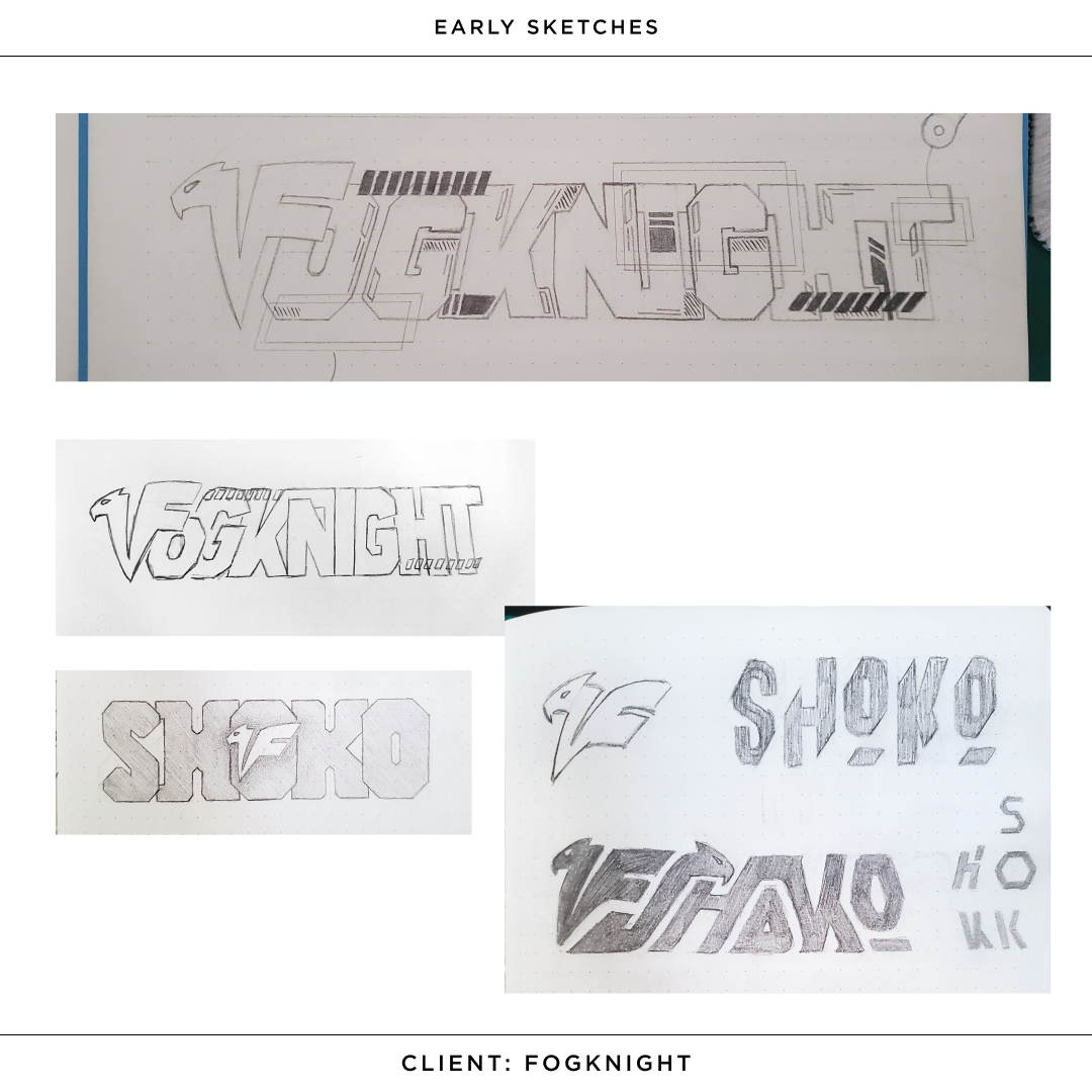
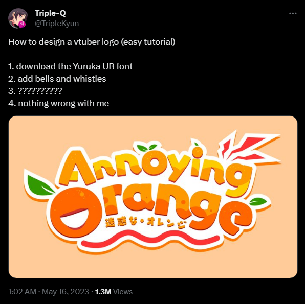
Roll It Back to 2021
At the time, the most popular and main style of lettering in the vtubing space was cute, bright, and illustration-led style of lettering. Thick, rounded sans-serifs being the most common.
These logos were made in this way in order to give the audience an immediate sense of the character and their personality through the design. The goal was to appeal to a wide audience. As time went by however, a growing number of people were looking for something more personalized to emphasize the authenticity and relatability that their unique streaming persona could provide.
When I started making logotypes, aside from including core details pulled from elements such as lore/backstory and visual character design, I pulled back from the explosive, bright colours in order to provide a more sophisticated and mature vibe.
CLIENT
ZiriaVT
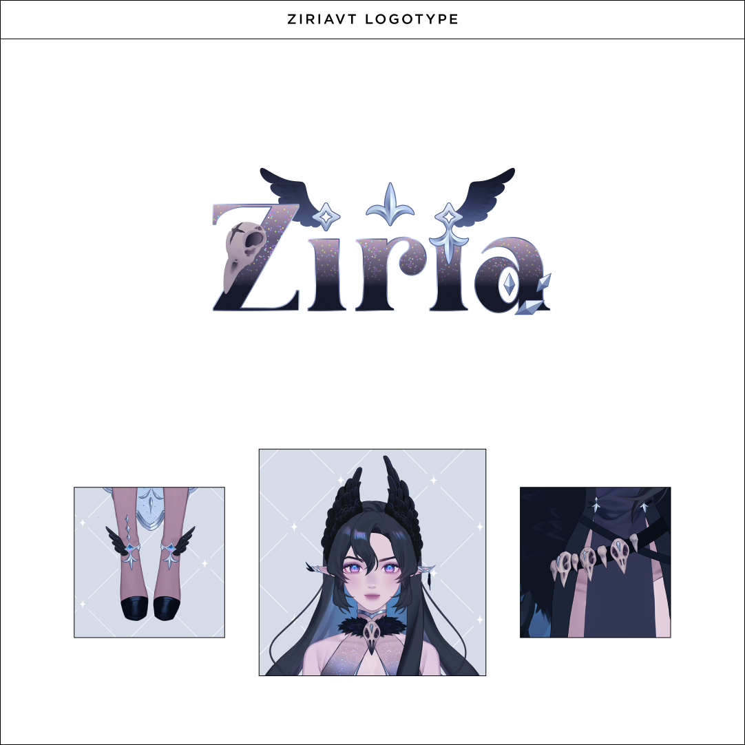
Ziria, "A deity of fate responsible for herding lost souls back to their pre-destined path."
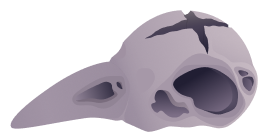
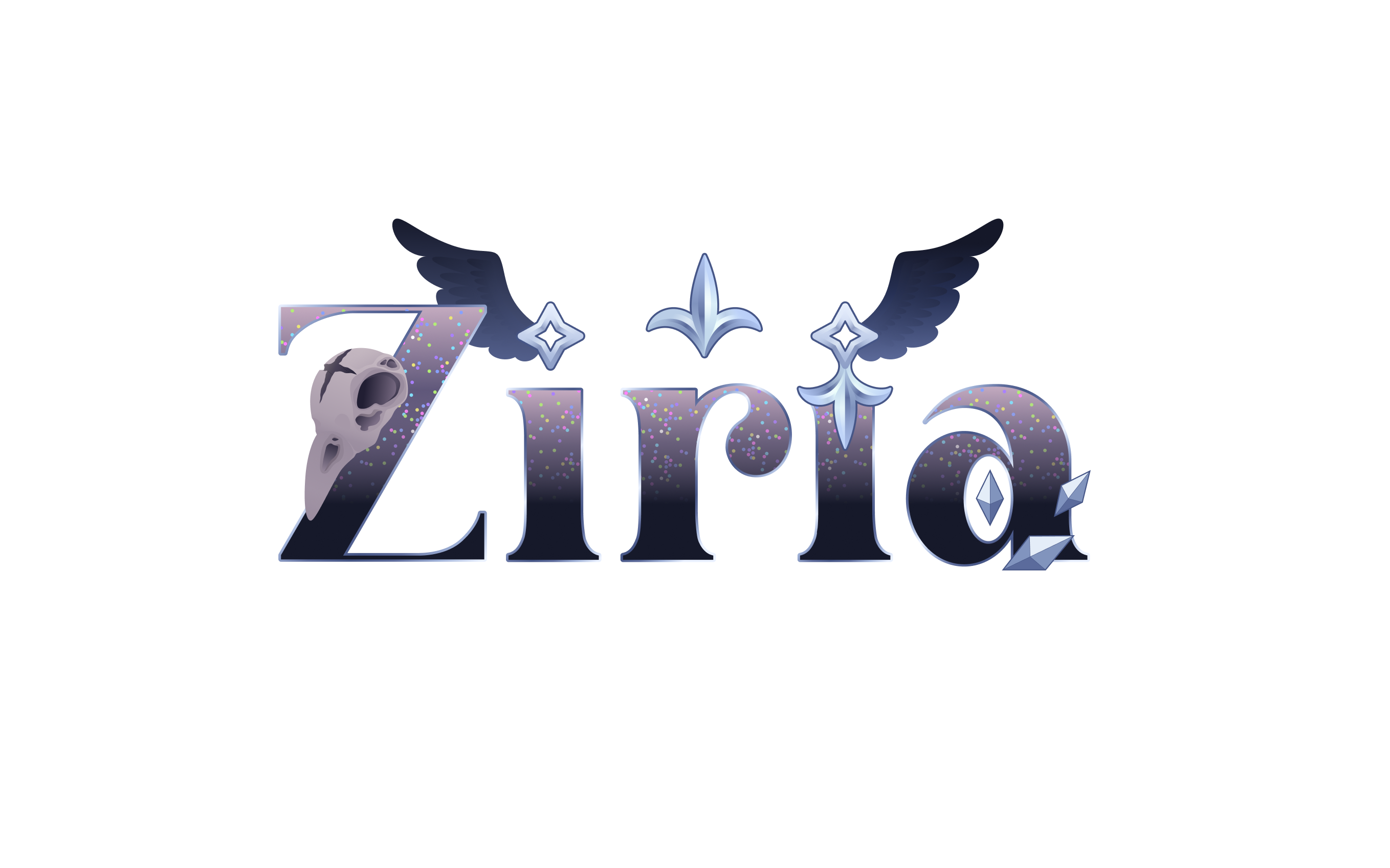
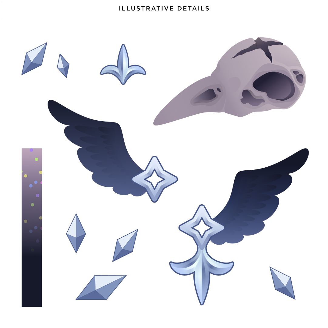
When working on this logotype, the thing that struck me the most was the outfit's visual design. You can see the various elements that ultimately made it to the final version: the bird skulls wrapping around her waist, the gradual gradation of her translucent glitter dress, the delicate ankle details.
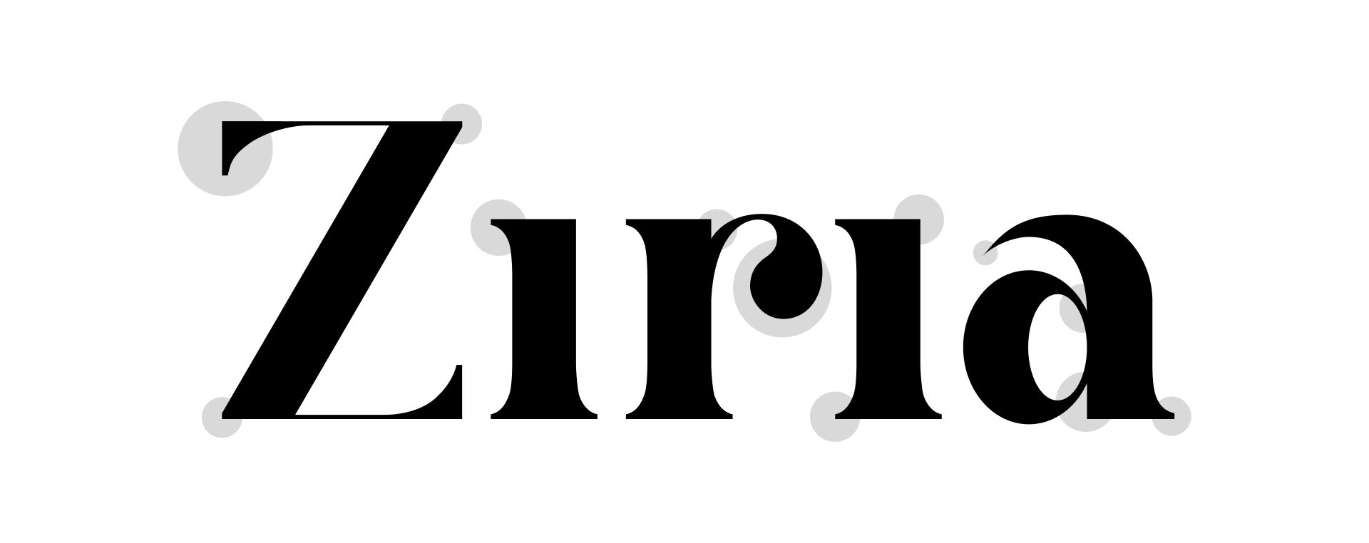
Key Points
Elegant serifs with curved brackets; fit for a deity of fate.
High stroke contrast for a modern feel.
Relatively high x-height to accomodate for the illustrative details.
Friendly rounded shoulder of the "r" and bowl of the "a" to balance out the sharp corners.
Super sharp "a" terminal to represent the sharp beaks of the bird skulls.
Final
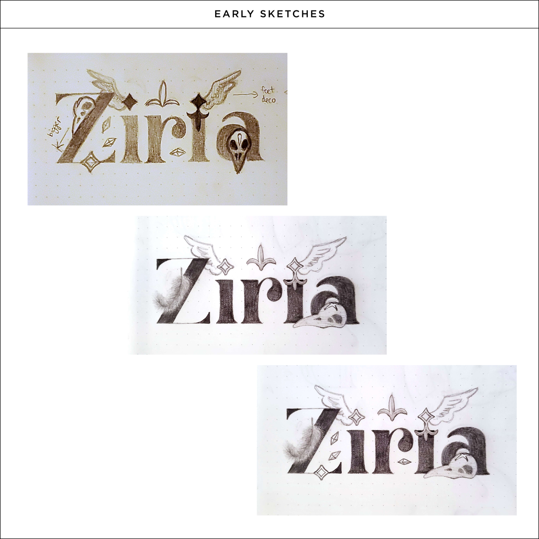
Extras

CLIENT
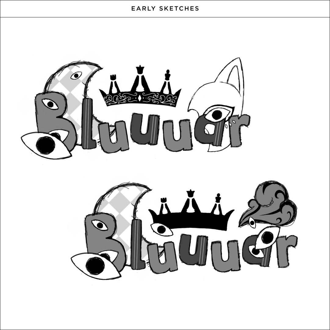
Bluuuar
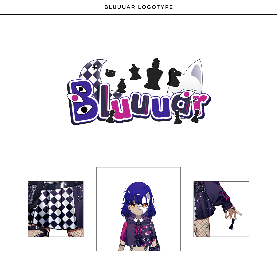
Bluuuar, "The Queen of Darkness that traps her victims into chess pieces."
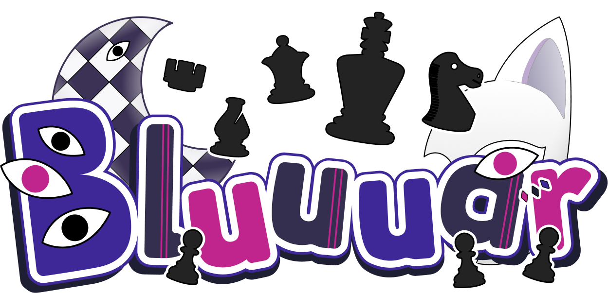
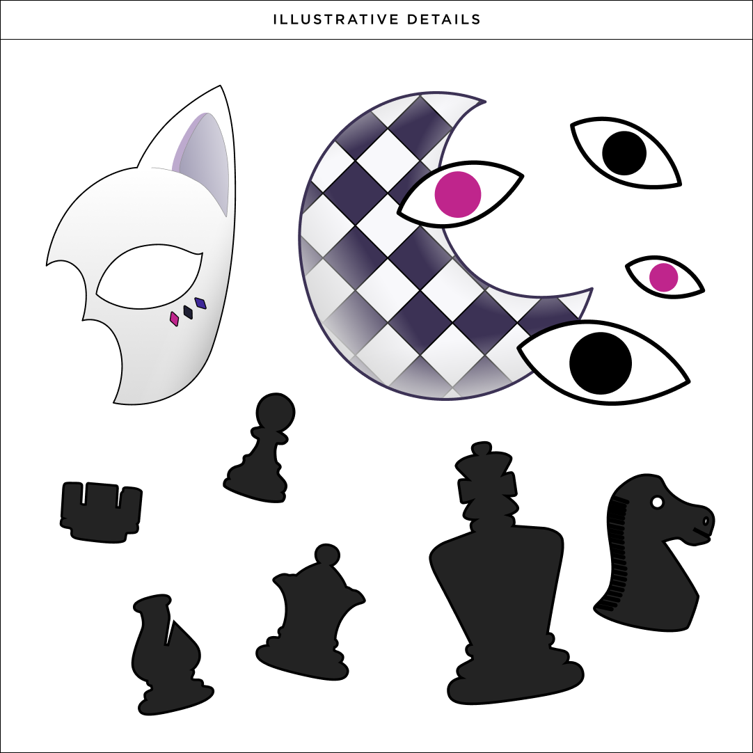
For this project, there were a good number of elements that inspired my execution: chess, the checkered dress, the unique design of the top featuring black and pink-pupiled eyes, the mask, etc. Many of which that can be seen reflected in the logotype.
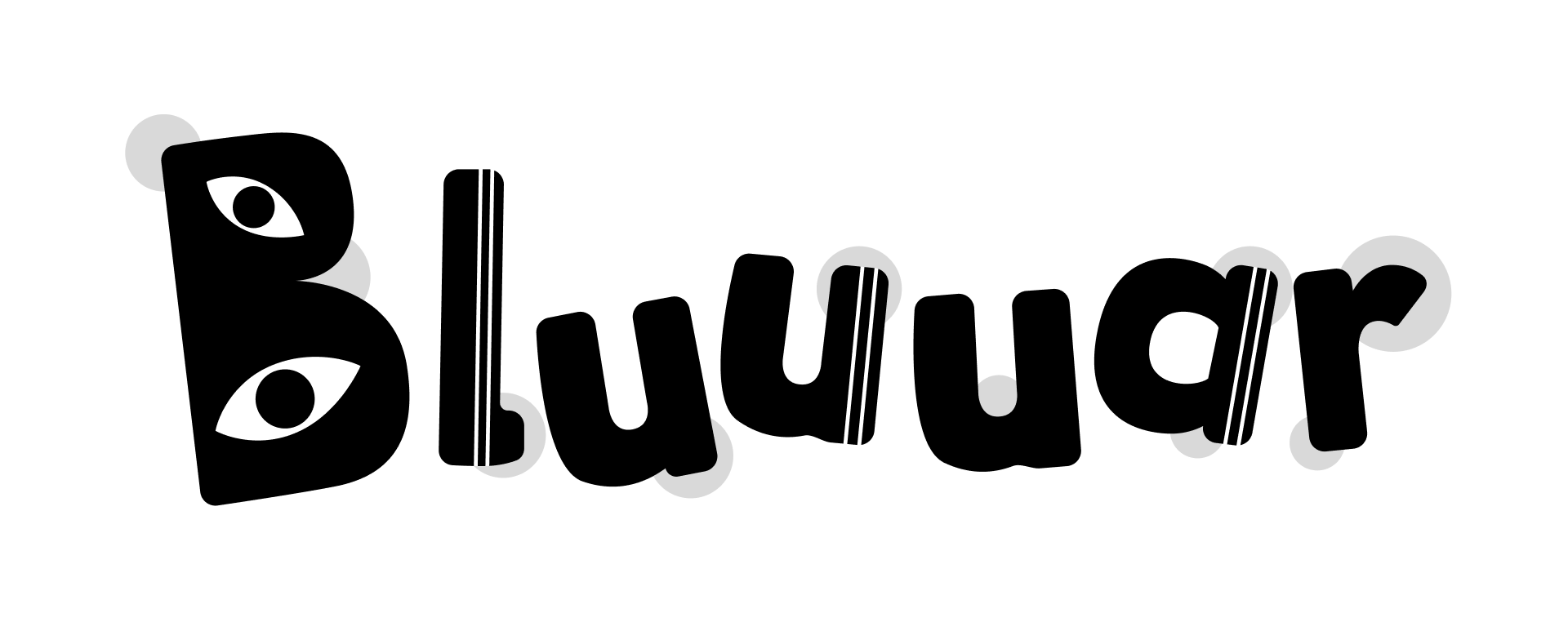
Key Points
Rounded sans-serif and lower x-height to keep things lively.
Duo stripe pattern on to the vertical strokes to reflect the same pattern seen on the character's outfit.
Eyes on the B also similarily reflect the character.
Slight spur on the l for visual interest.
Final
Extras

More To Come...